
Introduction
ipo calendar right issue calendar data analysis Python API is a powerful way to understand corporate actions in the stock market using real data. Instead of only analyzing price charts, investors can gain deeper insights by tracking IPO (Initial Public Offering) activity and Right Issue events.
In this tutorial, we will build a complete data analysis workflow using Python in Google Colab. You will learn how to fetch data from an API, process it into structured tables, and visualize trends using charts.
This guide is beginner-friendly and explains every step clearly, so even if you are new to Python or financial data, you can follow along easily.
Cell 1 — Import Libraries
import requests
import pandas as pd
import matplotlib.pyplot as plt
In this first step, we prepare the tools needed for the analysis.
requests→ used to fetch data from an APIpandas→ used to organize and process datamatplotlib→ used to create charts
Think of this as preparing your workspace before starting.
Cell 2 — Setup API
RAPIDAPI_KEY = "YOUR_RAPIDAPI_KEY_HERE"

headers = {
    "Content-Type": "application/json",
    "x-rapidapi-host": "indonesia-stock-exchange-idx.p.rapidapi.com",
    "x-rapidapi-key": RAPIDAPI_KEY
}
This step sets up the API connection.
The API key is required to access the data
Headers contain authentication and request information
⚠️ Never share your real API key publicly.
Cell 3 — Define API URLs
ipo_url = "https://indonesia-stock-exchange-idx.p.rapidapi.com/api/calendar/ipo"
right_issue_url = "https://indonesia-stock-exchange-idx.p.rapidapi.com/api/calendar/right-issue"
Here we define where the data comes from.
IPO API → provides IPO schedule data
Right Issue API → provides corporate action data
Cell 4 — Create Data Fetch Function
def get_api_data(url):
    response = requests.get(url, headers=headers)

    if response.status_code == 200:
        return response.json()
    else:
        print("Gagal mengambil data:", response.status_code)
        print(response.text)
        return []
This function simplifies the process of calling the API.
Sends a request
Checks if successful
Returns data in JSON format
This avoids repeating the same code multiple times.
📥 Cell 5 — Fetch Data
ipo_data = get_api_data(ipo_url)
right_issue_data = get_api_data(right_issue_url)
This step retrieves data from both APIs.
Now we have:
ipo_data→ IPO datasetright_issue_data→ Right Issue dataset
Cell 6 — Process and Combine Data
ipo_list = ipo_data["data"]["data"]["ipo"]
right_issue_list = right_issue_data["data"]["data"]["rightissue"]

df_ipo = pd.DataFrame(ipo_list)
df_right_issue = pd.DataFrame(right_issue_list)

df_ipo["jenis_aksi"] = "IPO"
df_right_issue["jenis_aksi"] = "Right Issue"

df_gabungan = pd.concat([df_ipo, df_right_issue], ignore_index=True)

df_gabungan.head()
This is the most important data preparation step.
Extract raw data from JSON
Convert into DataFrame
Add labels (IPO / Right Issue)
Combine into one dataset
Result: Clean, structured dataset ready for analysis.
Cell 7 — Bar Chart Analysis
jumlah_aksi = df_gabungan["jenis_aksi"].value_counts()

plt.figure(figsize=(8, 5))
jumlah_aksi.plot(kind="bar")
plt.title("Jumlah IPO dan Right Issue")
plt.xlabel("Jenis Aksi Korporasi")
plt.ylabel("Jumlah Data")
plt.xticks(rotation=0)
plt.show()
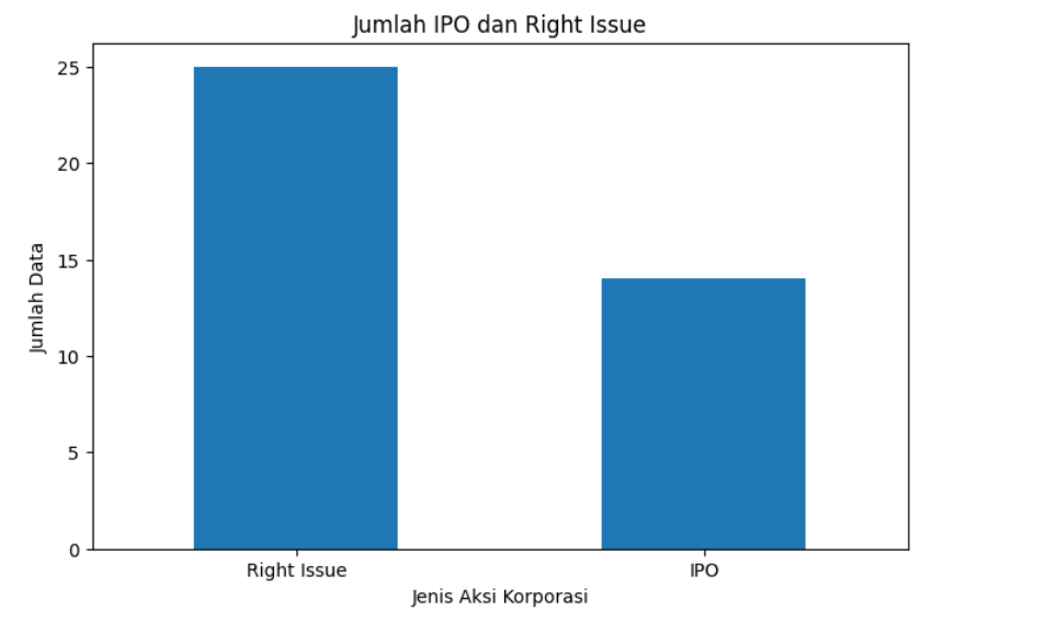
This chart shows the total number of IPO and Right Issue events.
👉 Helps answer:
Which activity is more dominant?
Result:
Cell 8 — Pie Chart Analysis
jumlah_aksi = df_gabungan["jenis_aksi"].value_counts()

plt.figure(figsize=(6, 6))
jumlah_aksi.plot(kind="pie", autopct="%1.1f%%")
plt.title("Persentase IPO dan Right Issue")
plt.ylabel("")
plt.show()
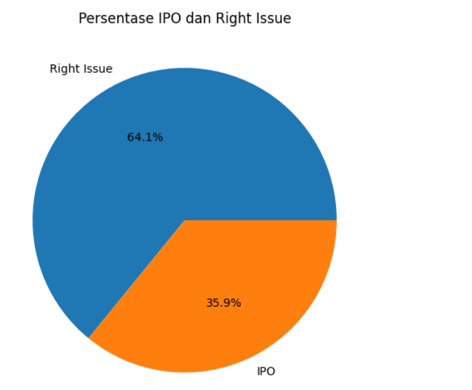
This chart shows the percentage distribution.
👉 Helps answer:
What proportion does each activity represent?
Result :
Cell 9 — Monthly Trend Analysis
df_gabungan["ipo_listing_date"] = pd.to_datetime(df_gabungan["ipo_listing_date"], errors="coerce")

df_clean = df_gabungan.dropna(subset=["ipo_listing_date"])

df_clean["bulan"] = df_clean["ipo_listing_date"].dt.to_period("M").astype(str)

data_bulanan = df_clean.groupby(["bulan", "jenis_aksi"]).size().unstack(fill_value=0)

data_bulanan.plot(kind="bar", figsize=(12, 6))
plt.title("Jumlah IPO dan Right Issue per Bulan")
plt.xlabel("Bulan")
plt.ylabel("Jumlah")
plt.xticks(rotation=45)
plt.show()
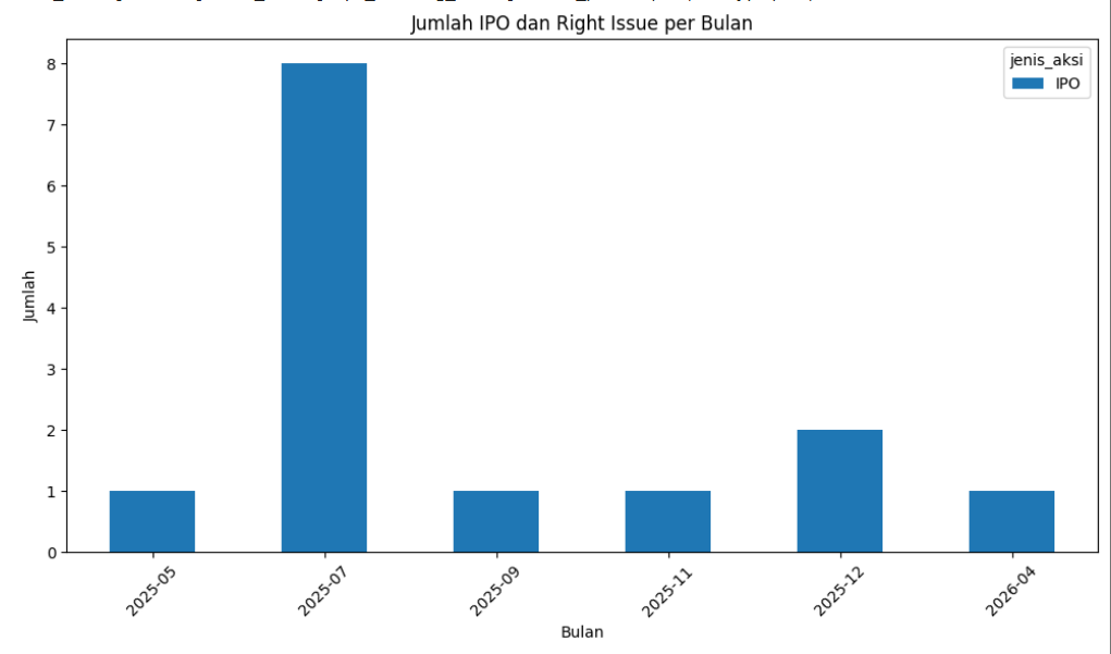
This is the most advanced analysis.
Converts dates
Cleans invalid data
Groups by month
Visualizes trends
👉 Helps answer:
Which months are more active?
Are IPOs increasing or decreasing over time?
Result:
Conclusion
ipo calendar right issue calendar data analysis Python API provides a clear and structured way to understand corporate actions in the stock market. By combining IPO and Right Issue data, we can move beyond simple price analysis and gain insights into market activity and trends.
This tutorial demonstrates a complete workflow—from API data retrieval to visualization. With this foundation, you can expand into more advanced financial analysis, build dashboards, or create investment tools.
The key takeaway is simple: data becomes powerful when it is structured, analyzed, and visualized clearly.